We presented our first
project of the 2013 Bond Issue (five buildings total) to the South Texas College Facilities Committee on July 13, 2015; the expansion of the Student Services Building
at the Starr County Campus, a facility we first designed 12 years ago (Mario Garza, Jr. originally designed this facility in 2003; expansion team consisted of Audrey Tower, Intern, Christopher R. Collins, Architect and Hector Rene Garcia, Architect).
An aerial
view of the campus, with the existing buildings shown in purple; (the original campus buildings A, B and C; the Manuel Benavides Jr. Rural Technology Building - J; the Workforce Development Building - D; the General Academic Building - E; the Library - F; the Student Activities Building - H; and the Student Services Building - G. The proposed expansion of the Student Services is shown in yellow, just south of the existing building "G". Existing parking lots
are on the north and east sides of the property with specific use parking
adjacent to the Library and the Student Services building and FM 3167 borders
the campus on its western edge. The two maroon shapes are future projects, the
new Library and Health/Science building.
The location of a new parking lot is also shown, directly south of the
Student Services expansion.
STC Staff
cited the need for quick and easy parking for prospective students to come to
the campus and begin obtaining information for the next step in their academic
careers. The placement of the expansion complies with that requirement, with
local building codes and allows for minimal disruption to the existing
landscape.
One
of the things Mata+Garcia Architects is interested in, as we reference the design, is - historical
context, looking at the history of Starr County, looking at things that have
defined its context……
…and then
using them architecturally in a contemporary setting.
Simple,
indigenous building forms are used to reinforce the direct no-nonsense nature
of the Student Services Expansion. This is the view as one approaches from the
future Library and Health/Science Buildings.
Staff asked that the new entry (left) be as transparent as possible,
with floor to ceiling windows creating a view of the excitement within.
The
glazing is shaded with a network of wood trellis members that recall the
“Sombrillas” used on local ranches and supported by dynamic V-shaped structural
steel supports, a variation of the “Chape” supports used on the original
facility. The simple brick detailing is taken from the historical Jose Ramirez
house in Rio Grande City. This is the view as one drives north on FM
3167.
Built to
a human scale with simple materials, the project is well suited to its location.
South Elevation: Continuing
the palette used in the existing facility, the envelope is covered with a
combination of brick (using detailing that recalls the historical buildings in
the county), stucco (used in the simple vernacular of the area) and corrugated
metal panels (used on utility structures throughout in the ranches of the
county).
East Elevation: The east
elevation is seamlessly tied-in to the existing building, through the use of
steel grate canopies (which reference local ranches and the mirror those on the
Student Activities Building), courtyards and existing landscaping; resulting in
a natural progression and integrated design that defies the common excuse that
“it’s just an addition.” The intent is to have the landscape surround the
building in an informal placement, offering a sense of surprise, peaceful
courtyards that capture the senses, and shady places for students to relax or faculty
to unwind.
West Elevation: The west
elevation faces FM 3167 and serves as a secondary courtyard entry for those
parking on the west lot.
North Elevation: On the
north elevation we have mirrored the Tuscan Red stucco found on the existing
building to create a vibrant outdoor space shaded by mesquites that blanket the
area.
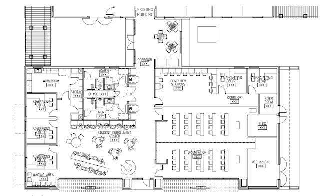
The
program calls for 4,000 SF for the two departments (Admissions & Financial
Aid), with 1,736 SF in Support Space for a total of 5,736 SF. The project is under
the programmed square footage by 32 SF.
As
students arrive they will enter the facility on the south side, where they will
immediately be greeted & receive information at the circulation desk. The open
space to the left is the Student Enrollment Center. Just beyond are a waiting
area and the Admissions Office – with space for three counselors, a Storage
Room and a Work Room. Across the aisle,
an Orientation Center, with a seating capacity of 40 students, is designed to
work jointly with the Welcome Center as one space, or as a
separate room. The goal is to foster
collaboration and the exchange of ideas as students move throughout the combined
spaces.
The
Financial Aid Office will house an Application Area with 10 stations, two
Counseling Offices and a quiet area for students who are military veterans to gather. Support areas (mechanical/electrical) are placed along the east
perimeter walls or in strategic areas (restrooms). A secondary entry point allows for easy access
to and from the west parking lot. This
courtyard entry allows for a display area, views to a second courtyard, space
for vending machines and access to either the existing facility or the
expansion area.
Together with the South Texas College staff, Mata+Garcia Architects has created an efficient, functional and timeless design that reinforces the existing campus fabric.
Addendum of 07.18.15:
After our presentation we were asked to make minor adjustments to the layout of the floor plan; relocating the Veterans Room to an area in the existing building, thus increasing the space for the Financial Aid Office and the Orientation/Multi-purpose space. This drawing shows the Orientation area as one single space accommodating 40 students.
This drawing shows the Orientation area as two spaces, each one accommodating 20 students.


No comments:
Post a Comment